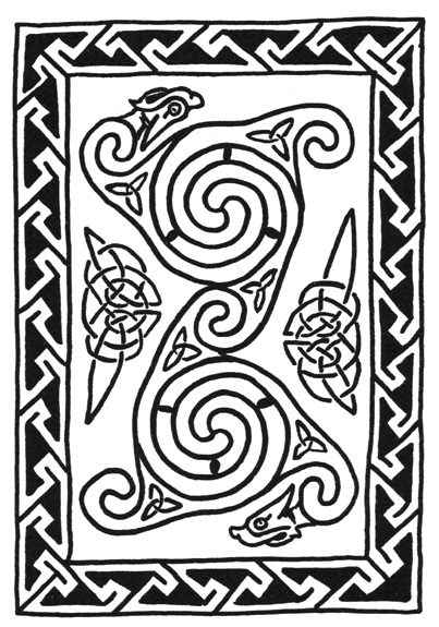
This I think was the first of the mass-production designs, and as you can see it is not very funny. The rest are funnier, or at least attempt to be. I want you to know now that I was doing Celtic designs before they became insufferably trendy. I did some nice lettering for the inside, and signed off with my Lloyd logo. I think that the slightly imprecise nature of the lines improves it, although there is something wrong about having used a felt-tip pen.
Here you see the 1994 design. This one was quite a success, and I wonder if any card manufacturer would be interested in it.
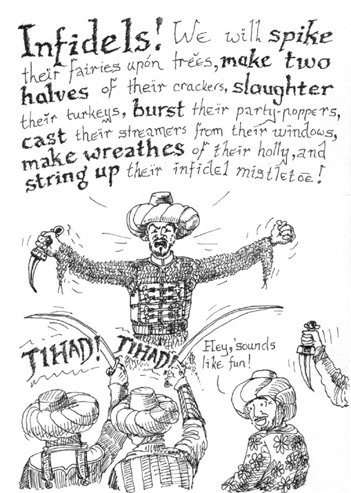
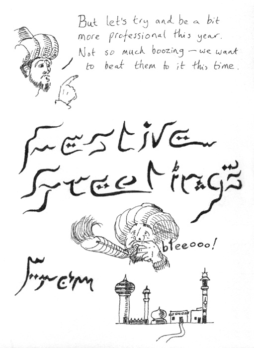
This one is possibly my favourite. I recall that it took me ages to come up with the idea. Causing me some amazement, many people seemed unable to read what I had written on the inside (right). If you are having trouble deciphering the Arabic and the buildings at the bottom, just squint and it should become clearer. I suspect that this design is not tremendously commercial.
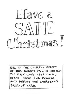
This one was possibly my most popular card, but I suspect only because it was three cards in one. Inside the main card was the message you see above these words. Astonishingly, almost every recipient suffered immediate primary card failure and had to reach inside the folded A4 sheet to retrieve the second card which was a folded quarter A4 (A6), which then in every case failed too, and the recipients reported having to reach inside the second card to retrieve the third, which was only a sixteenth of A4 size (A8). Thank goodness I had taken so many precautions.
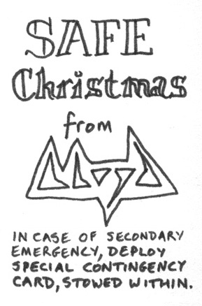
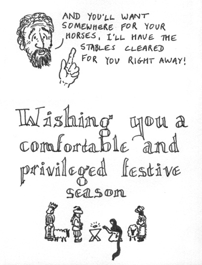
Front and inside design of emergency back-up card (left). Front design of special contingency card (above right).
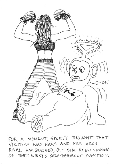
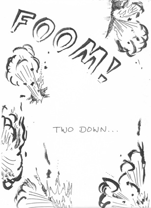
1997 was the year of the Spice Girls and the Telletubbies. You couldnĺt escape them. Here I dealt with both at once. To the left you see the front, above these words was on the inside left, and the message below was on the back.
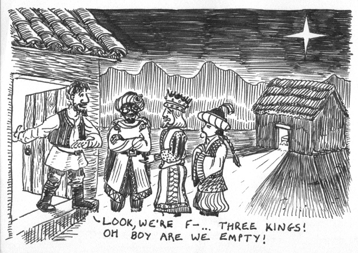
This one was not a great success. I thought that it was tolerably funny, but it seems that most people didnĺt get it. In case you donĺt either, I shall explain: the inn-keeper is about to say ôLook, weĺre fullö but he then notices those who have turned up wanting a room are three kings, and he is jolly pleased at this and changes his tune. Mary and Joseph did not get this treatment, and things are about to get worse for them... I think some people thought that the three kings were speaking, and that they were about to swear. Possibly I should get brighter friends.
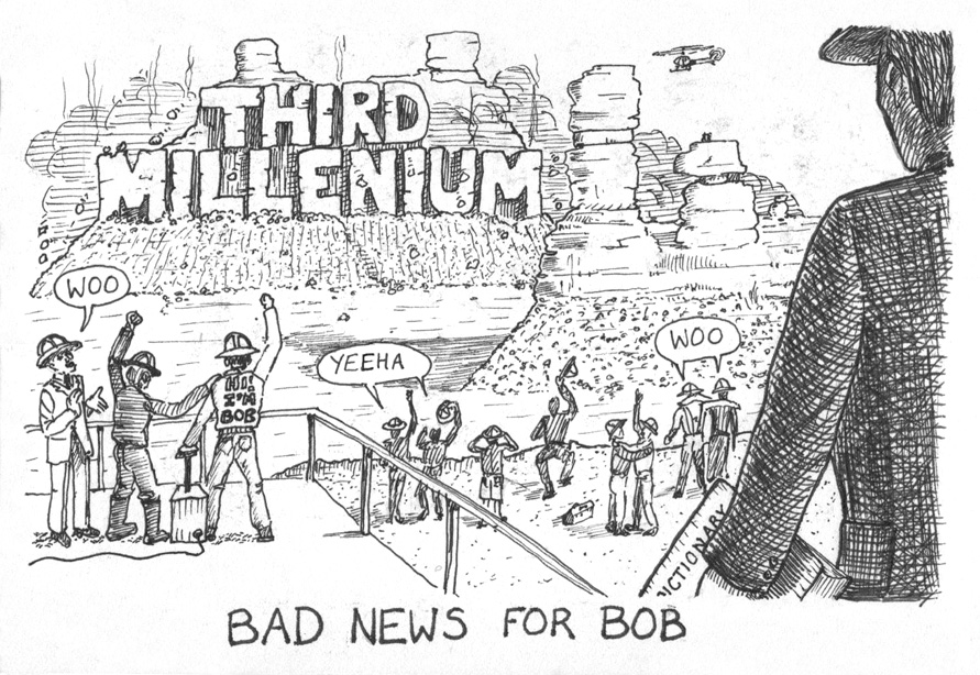
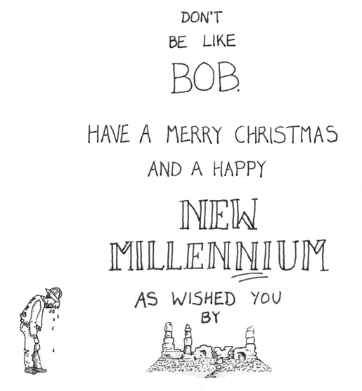
Oh dear. This design was another failure. Again, people just didnĺt seem to get the gag. A man is walking into the picture with a dictionary. Shortly, he will break the bad news to Bob that his spectacular dynamiting of the Monument Valley mesa into the words ôThird Milleniumö contains a spelling error. Millennium, you see, has two Ns, which catches lots of people out. A friend of mine worked for a greetings card maker, and at the last meeting before their entire millennium range went to print, she spotted, after a conversation with me on this topic, that they all needed to be changed. A rather posh friend of mine who got this card said that correctness of spelling was a rather bourgeois concern.
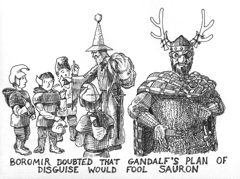
After years of failure, I was determined to make a card that people understood. The Lord of the Rings was all the rage, as Peter Jackson was mangling his way through them in the cinemas. Gandalf looks a bit like Father Christmas, and hobbits look a bit like his little helpers, but Boromir doesnĺt look much like a reindeer. There. Thatĺs the gag.
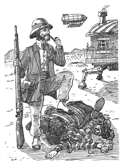
The play The Adventures of Stoke Mandeville, Astronaut and Gentleman was the inspiration for this one. Here we see a portrait of Stoke in a typical pose: with his foot on a pile of dead Frenchmen, his astral carriage in the background on the surface of New Milton Keynes (fourth moon of Jupiter).
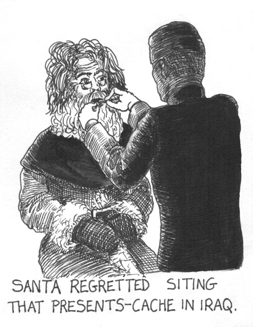
Just before Christmas 2003 Saddam Hussein was captured and we all watched pictures of him with long greying hair, being examined by a medic. Iĺm sure Iĺm not the only one to remark that he looked like Santa in that famous scene.
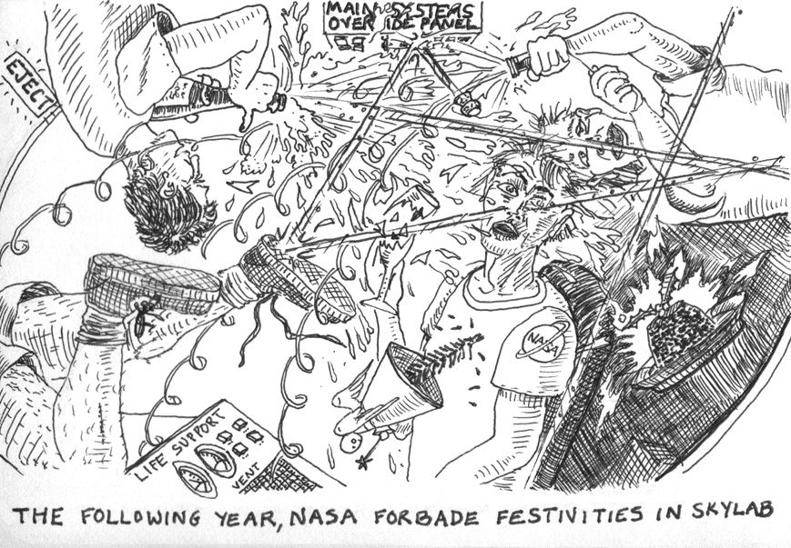
The 2005 effort. I imagine that being Christmassy is a challenge in orbit. Candles donĺt burn in zero-G, and every tiny particle that flew into the air from a party popper would continue to fly around for some while. I would be interested to see a shaken champagne bottle opened in zero-G, but I wouldnĺt want to be relying on any nearby life support systems that were not thoroughly champagne-proofed, nor would I want to be given the task of clearing up afterwards, although if it would get me a free trip into space, Iĺd volunteer.
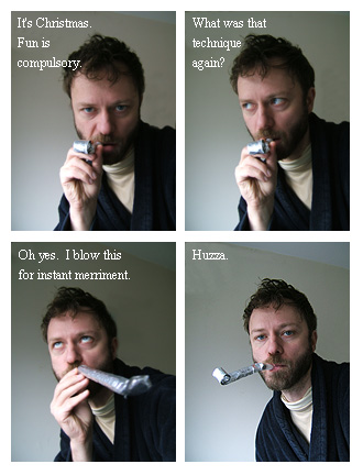
And it is to this that things degenerated: a photo montage. To be honest, though, this did probably reflect my festive feelings better than most of what went before.