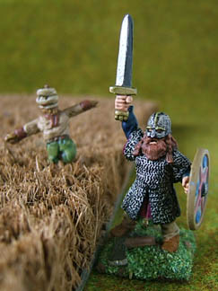
| Yet another benefit is that weapons look sharp. Here you see a Prince August Viking spearman converted into an axeman. Most of the axe is dark silver, with a line of bright silver along the sharp edge, giving the axe a dangerous look. The spear in the background, and the edge of the scythe have been given the same treatment. |
|
|
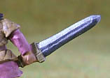
The technique also creates an exaggerated 3D effect. Here I have used it to suggest a fuller on a blade that in reality has no sculpted fuller. A fuller is a channel that runs down the centre of some sword blades to make them light, strong and flexible (and not, as you will read in some old books, to facilitate the victim's bleeding). The sculptor had given me a flattish section of sword to paint in the middle of the blade. I have painted the fuller as mostly dark, but have picked out the lower edge of it in the bright silver highlight colour. I have assumed that the sword is lit from the top.
|
You have to use your judgement when deciding which side of a sword to highlight. A good rule of thumb is to hold the figure with its front facing you, and imagine that the sword is being lit from the top left.
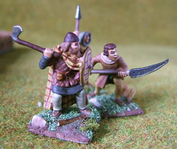
| The 3D effect is useful on shield bosses too. When painting shield bosses, I first paint them black, then dry brush them dull silver, then add a blob of silver to the upper left part of the raised boss. This highlight makes the boss stand out, as you see here. It is a fact that the amount of highlighting and shading you need to make something look right increases as figures get smaller. If a figure were life size, you wouldn't need to paint on highlights or shading, but a small figure has shallower recesses, which create weaker shadows. In this photograph, the painted highlights coincide with the highlights created by the lighting, making the bosses look life-sized. |
|
|