There are several different schools of thought about figure painting. Some people like gaudy cartoony figures, some like drab realistic ones. Some are prepared to take an age to paint every figure, while some want to get on with it. Some say that one should paint figures to look good at arm's length, while others want figures to bear close scrutiny. In my own opinion, my painting methods give fairly quick results, are fairly realistic, while not too drab, and bear reasonably close scrutiny.
One common way to paint figures involves painting them a very dark colour first, and then painting on ever smaller blobs of ever lighter colours, leaving dark lines showing through in between the blobs. The results of this technique can be quite striking, but they are not the way I do it. My way is a bit quicker, more realistic, and doesn't require as much care.
I undercoat the figures with acrylic (preferably Humbrol as this dries with a good porous surface) paint. The colours I pick are pale browns, and biscuity tans. Over this, I paint a block flesh colour over the whole face. The best flesh colour I have ever discovered is also very cheap. It is Anita's "dusty peach", which you might find for sale in a craft shop, or, as I did, in a remaindered bookshop.
Next, I mix a pale version of the flesh colour, and I paint the highlights. The brow ridge gets a horizontal line, the bridge of the nose gets a vertical stripe down it, and then I pick out whatever else seems appropriate on the figure, such as above the upper lip, the cheekbones, the point of the chin, tips of the ears etc. The highlight colour is quite a bit paler than the block colour, and at this stage you may think that the contrast is a bit too great. Fear not. Fingers and knuckles are also picked out with the highlight colour.
The eyes I paint by first getting a very fine brush, and holding it horizontally, I apply, preferably in a single action, a blob of very dark brown. I water the paint down slightly, to get it to behave as I want. All going well, this blob will be slightly larger than the whites of the eyes, and will come to a point at its left and right ends. Next, I slightly thin some white paint, and do the same again, only this time the blob is slightly smaller, lying within and on top of the dark brown blob. If this goes well, I now have the white of the eye, surrounded by a thin dark line, representing the eyelashes, and giving some life and contrast to the eye. I then dot in the iris, usually with brown, but sometimes with blue. The iris dot should touch the upper eyelash line. If it doesn't, your figure will have a mad staring look which is appropriate if they are meant to be mad or terrified, but otherwise is best avoided.
Some figures are not improved by having the eyes painted. If a hat comes down low over the eyes, if the eyes are poorly sculpted, or are only open a crack, then you may be better off leaving the eyes alone, or perhaps just representing them with a little dark smear.
On some figures, the lips are prominent or the mouth is open. I never use red paint on lips or mouths. It is too vivid, and makes figures look as though they are bleeding or wearing lipstick. I use a dull brick-red colour, such as Humbrol brick red, or Citadel swamp brown.
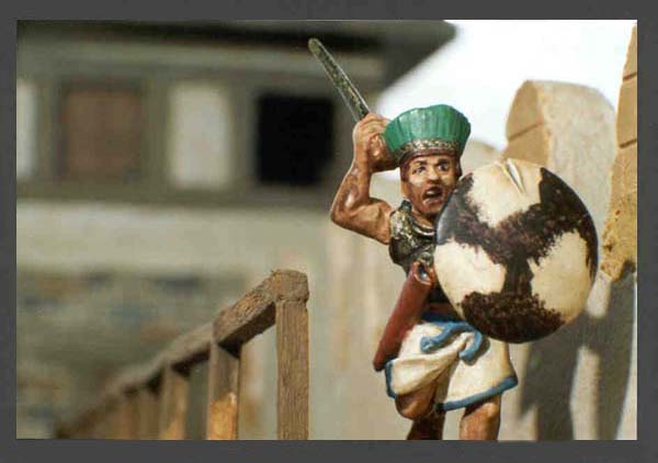
On some figures, it seems appropriate to give them a five o-clock shadow. This is simple enough, with some much-thinned dark brown paint. I use this too for chest hair, forearm hair, and leg hair if these parts of the figure are exposed. Aeneas (below) has been given this treatment.
Some figures demand eyebrows to be painted on them. The village idiot (above) I have given a monobrow. Obviously, blond figures can look wrong with a lot of dark body hair and dark eyebrows. You have to use your judgement. On some figures, especially blond and ginger ones, I sometimes add a little reddish paint to the cheeks and end of the nose, for a weather-beaten or boozy look.
A word on hair colours: never use yellow paint for blond hair. Use sand instead. Similarly, ginger hair looks wrong if you use orange paint. Use a very orangey brown, such as Miniature Paint's "leather" or Citadel's "snakebite".
The faces you see in these photographs, I hope you'll agree, have a subtle shading to them, and do not seem to have harsh highlights, or clear edges to the shadows. I achieve this effect by mixing in brown paint with my varnish. The pigment will settle in the recesses, and give you this nice shading effect. It will also blend all the colours you have painted so far together, and hide many mistakes. For example, you may have thought that the white you used for the eyes looked a bit bright, but this will be taken care of by the varnish. The village idiot's white undershirt was simply painted off-white, and then varnished. The pigment in the varnish did all the shading for no effort from me.
One more thing: can anyone tell me why wells had roofs over them, as in the photo of the village idiot? To stop the rain falling into them? To give the birds somewhere to perch and shit into the water? The only reason I can think of is to stop the rope of the winding mechanism getting wet, but is this so important?